


Barcelona 1992 – Paralympic Emblem
Designer – Josep Maria Trias
Symbol and logo for the Paralympics
The symbol of the Barcelona’92 has its origin in the Olympic Games Emblem. The identity of the Paralympics had to be able to be recognised and associated to the Absolute Games, but it could not be the same, it had to have its own personal image. So, the symbol designed aims at transmitting the same concepts of humanity and Mediterranean-ness by the humanised and anthropomorphic expression of its stroke, and by its three colours: Mediterranean blue, yellow of the sun and red for life. Then, to the blue head in the centre and the yellow arms outstretched in welcome and friendliness was added a third red circular element which gave it is finishing touch and which wants to be a synthesis between legs and the main element of the universal and symbolic wheelchair for the handicapped. The logos “Paralímpics” and “Barcelona’92” have been composed using the same letter type used in the Absolute Games in order to give the symbol the same contrast of graphic and typographic character.
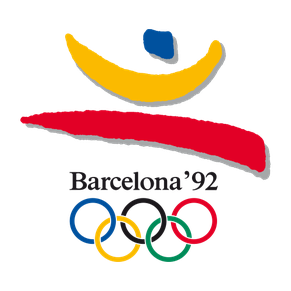
FINAL EMBLEM FOR THE BARCELONA 1992 OLYMPIC GAMES

FIRST VERSION FOR THE PARALYMPIC EMBLEM. THIS VERSION WAS REJECTED BY THE IOC
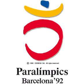
FINAL EMBLEM FOR THE BARCELONA 1992 PARALYMPIC GAMES
